Using various Machine Learning regression techniques to analyze and model data.
This personal project aims to showcase various data analysis and regression techniques to demonstrate my proficiency in these areas and to gain further experience in working with big data sets. This involves cleaning data, performing exploratory data analysis, and applying machine learning techniques to understand what is behind the numbers and make reliable predictions The end goal is to produce a comprehensive report or presentation that summarizes the findings and recommendations derived from the project.
Disclaimer: A Kaggle Dataset
Importing Python Libraries
import pandas as pd
import numpy as np
import seaborn as sns
import matplotlib.pyplot as plt
import matplotlib.colors
import warnings
from collections import Counter
Nature of the Dataset
df = pd.read_csv('InsuranceExpenses.csv')
<class 'pandas.core.frame.DataFrame'>
RangeIndex: 1338 entries, 0 to 1337
Data columns (total 7 columns):
#   Column    Non-Null Count  Dtype
---  ------    --------------  -----
0   age       1338 non-null   int64
1   sex       1338 non-null   object
2   bmi       1338 non-null   float64
3   children  1338 non-null   int64
4   smoker    1338 non-null   object
5   region    1338 non-null   object
6   expenses  1338 non-null   float64
dtypes: float64(2), int64(2), object(3)
memory usage: 73.3+ KB
print('Number of Duplicate values:', df.duplicated().sum())
Number of Duplicate values: 1
As a preliminary inspection, the dataset contained no missing data along its columns but revealed one duplicate across its rows. It is then necessary to eliminate the duplicate to straighten its reliability as we move further down the analysis.
The sex attribute contains: ['female' 'male']
The smoker attribute contains: ['yes' 'no']
The region attribute contains: ['southwest' 'southeast' 'northwest' 'northeast']
About the features/attributes:
- The Body Mass Index (bmi) is a float variable that describes a person’s weight distribution. It is derived from the body mass divided by the square of the body height.
- Sex (sex) is a dichotomous category variable that describes whether a person is male or female.
- Age (age) in this data is a discrete variable that ranges from 19 to 64 years old
- The number of children (children) a person has ranges from 0 to 5 children.
- The smoking habit (smoker) simply describes whether a person smokes or not. It is also dichotomous in nature.
- Region (region) is divided into 4 major areas: SW, SE, NW, NE.
About the target:
- Expenses (expenses) is a float type that is assumed to be affected by all/some of the features above. Since the data has not provided any particular currency for this variable, it will remain unitless all throughout the analysis.
X_int = df.select_dtypes('int64')
X_flt = df.select_dtypes('float64').drop(['expenses'], axis=1)
X_cat = df.select_dtypes('object')
Y = df['expenses']
Exploratory Data Analysis
Target Variable: Expenses
fig_1, axs_1 = plt.subplots(nrows=1, ncols=1, figsize=(10, 10))
sns.kdeplot(Y, fill=True, color='#f37651')
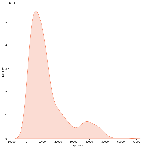
The expenses shows a right-skewed distribution where most points lie around 9,000 while they taper off at high values. Given this statistical nature, it is best to represent the target with the median as the central tendency. On the other hand, it is misleading to represent it with its mean as this measure of central tendency considers every data point (even outliers in a skewed distribution).
Feature: Age
fig_2, axs_2 = plt.subplots(nrows=1, ncols=1, figsize=(20, 10))
sns.countplot(X_int['age'],  palette='rocket')
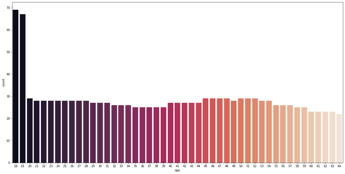
It can be initially seen that the dataset is mainly comprised of 18- and 19-year-olds at a frequency above 65, while the rest are around the same frequencies between 20 and 30.
To ease the data visualization, the ages were binned into eight categories as shown below, and were analyzed against the target variable.
def age_categorizer(age):
    if age <= 23:
        return '18-23'
    elif age <= 29 and age >= 24:
        return '24-29'
    elif age <= 35 and age >= 30:
        return '30-35'
    elif age <= 41 and age >= 36:
        return '36-41'

    elif age <= 47 and age >= 42:
        return '42-47'
    elif age <= 53 and age >= 48:
        return '48-53'
    elif age <= 59 and age >= 54:
        return '54-59'
    elif age <= 65 and age >= 60:
        return '60-65'

df['age_group'] = df['age'].apply(lambda x: age_categorizer(x))
fig_3, axs_3 = plt.subplots(nrows=1, ncols=1, figsize=(20, 20))
sns.swarmplot(x='age_group', y='expenses', data=df, palette='rocket', size=10, order=['18-23', '24-29', '30-35', '36-41',
                                                                                      '42-47', '48-53', '54-59', '60-65'])
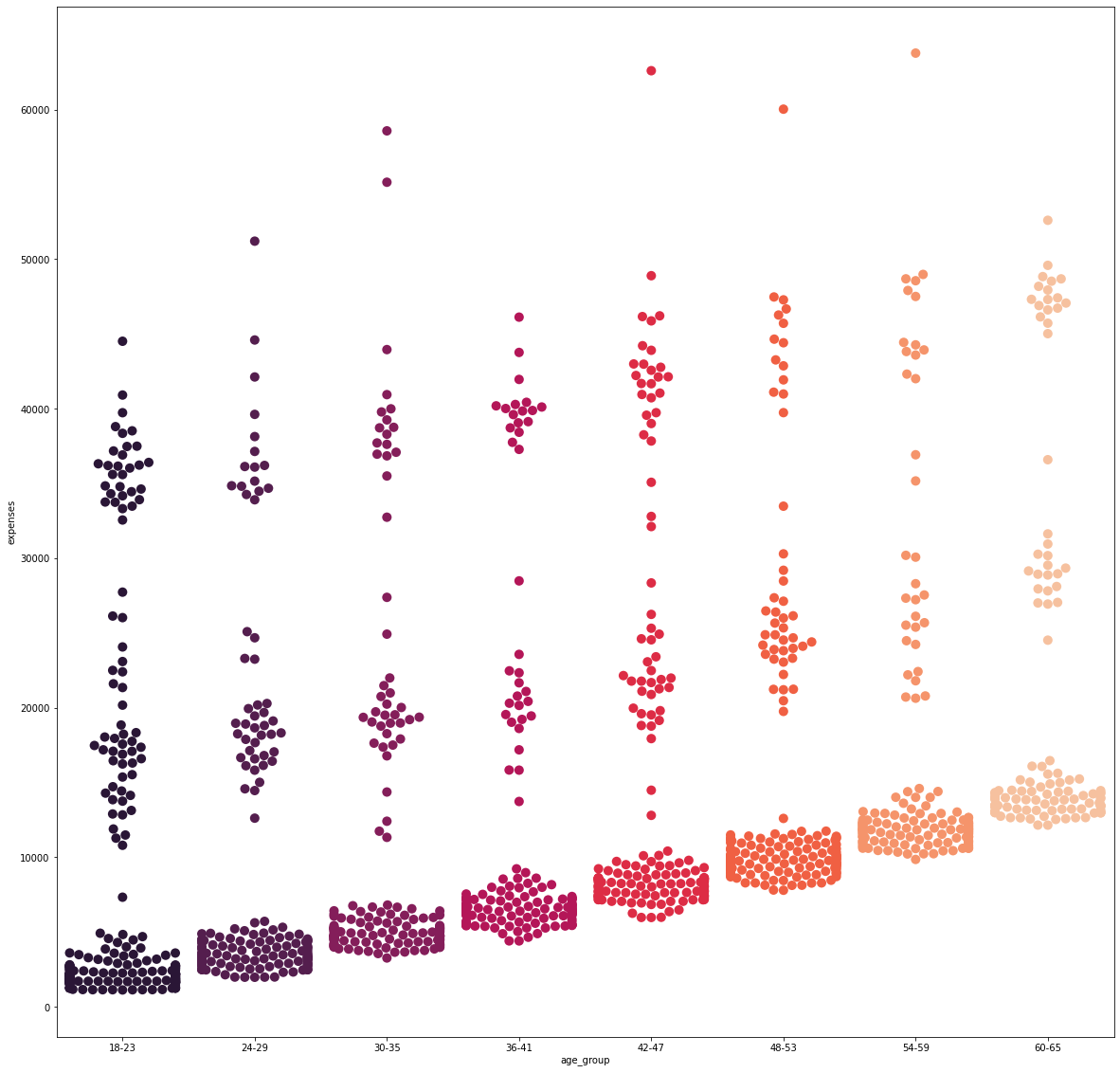
It is evident that as the age group increases, the base cost for each category steadily increases. However, it can be further noticed as to how, at each category, there are distinct patches of data points as the expenses increase vertically. This will be further analyzed later on.
Feature: Number of Children
fig_4, axs_4 = plt.subplots(nrows=1, ncols=1, figsize=(20, 10))
sns.countplot(X_int['children'],  palette='rocket')
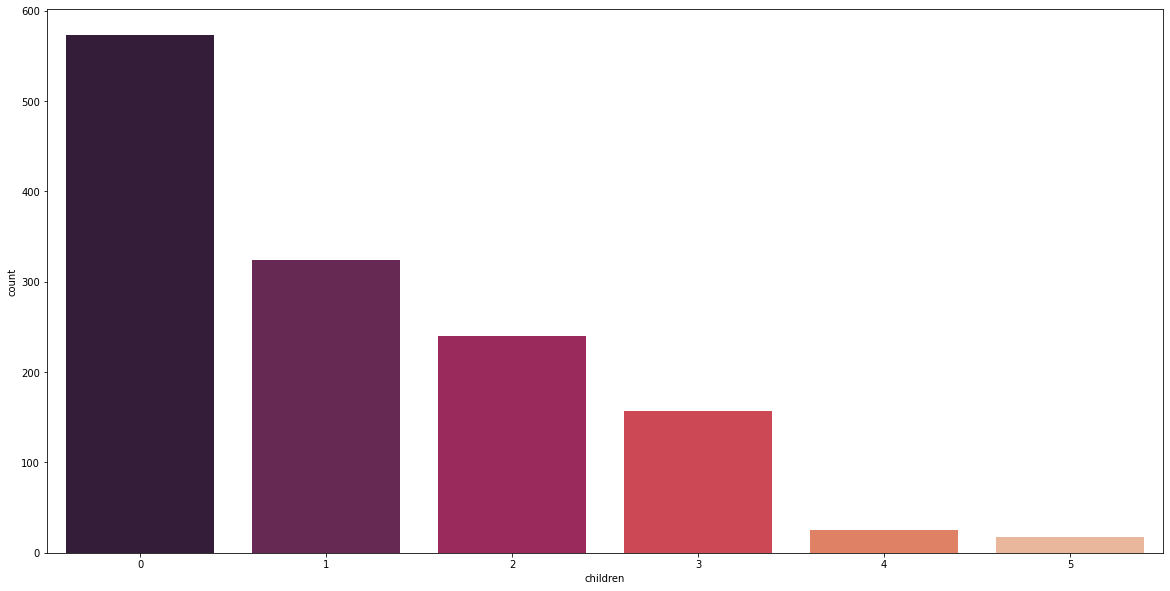
Majority of the individuals in the dataset have no children. Furthermore, it is interesting to see that 66% of 18- to 23-year-olds and 70% of 60- to 65-year-olds have no children. age_v_children = df.groupby([‘age_group’])[‘children’].value_counts(normalize=True) print(age_v_children)
fig_5, axs_5 = plt.subplots(nrows=1, ncols=1, figsize=(20, 20))
sns.swarmplot(x='children', y='expenses', data=df, palette='rocket', size=10)
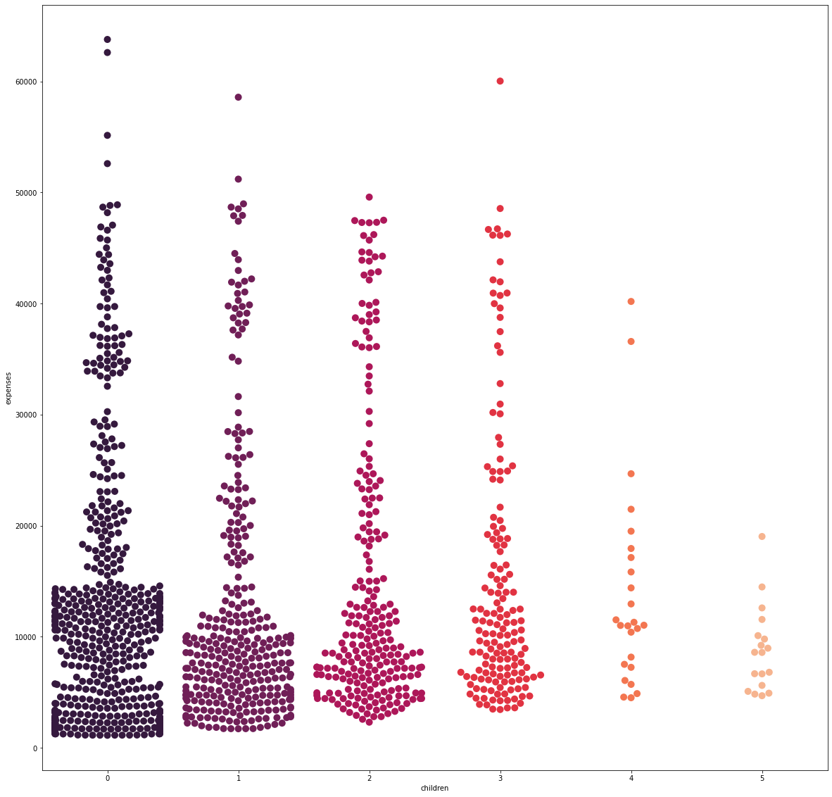
From the visualization alone, there is no distinguishable trend in expenses as the number of children increases.
Feature: Body Mass Index
fig_6, axs_6 = plt.subplots(nrows=1, ncols=2, figsize=(20, 10))
sns.kdeplot(X_flt['bmi'], fill=True, color='#701f57', ax=axs_6[0])
sns.regplot(x='bmi', y='expenses', data=df, color='#701f57', ax=axs_6[1])
.png)
The distribution of the BMI is fairly normal as it is centered around the 30 mark.
The scatterplot shows that as the points move up the y-axis, the distribution becomes more “scattered,” especially starting around the 30 to 35 BMI marks. Therefore, to investigate further, the raw BMI values are binned into their natural categories: Underweight, Normal, Overweight, or Obese.
def bmi_categorizer(bmi):
    if bmi < 18.5:
        return "Underweight"
    elif bmi >= 18.5 and bmi < 25:
        return "Normal"
    elif bmi >= 25 and bmi < 30:
        return "Overweight"
    else:
        return "Obese"

df['bmi_group'] = df['bmi'].apply(lambda x: bmi_categorizer(x))
fig_7, axs_7 = plt.subplots(nrows=1, ncols=1, figsize=(20, 20))
sns.boxplot(x='bmi_group', y='expenses', data=df, palette='rocket', order=['Underweight', 'Normal',
                                                                                       'Overweight', 'Obese'])
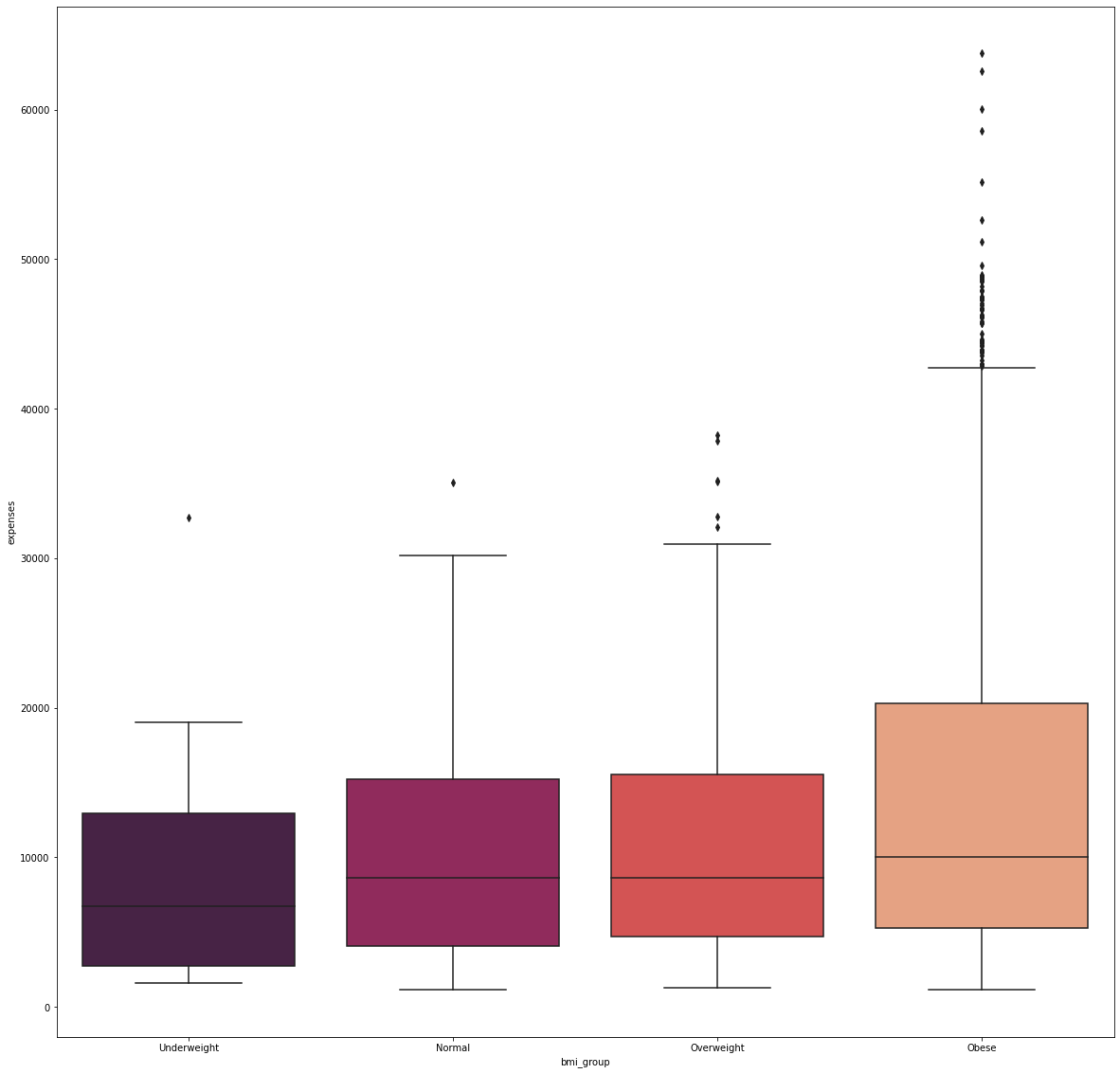
Majority of the people in the dataset are obese while underweights are at the minority.
It was shown that obese patients have the most number of expenses which were considered to be outliers. In this case, there were 79 individuals who spent more than 40,000 for their medical bills to which 63,770 was the largest amount spent.
Feature: Sex
sex_count = X_cat['sex'].value_counts().to_frame().rename(columns={'sex':'frequency'})

fig_8, axs_8 = plt.subplots(nrows=1, ncols=1, figsize=(10, 10))
plt.pie(sex_count['frequency'], autopct='%.2f%%',
       colors=['#35193e', '#ff9155'], textprops={'color':"w", 'fontsize': 14})
plt.legend(sex_count.index)

hole=plt.Circle( (0,0), 0.4, color='white')
p=plt.gcf()
p.gca().add_artist(hole)
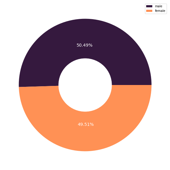
fig_9, axs_9 = plt.subplots(nrows=1, ncols=1, figsize=(20, 20))
sns.boxplot(x='sex', y='expenses', data=df, palette='rocket', order=['male', 'female'])
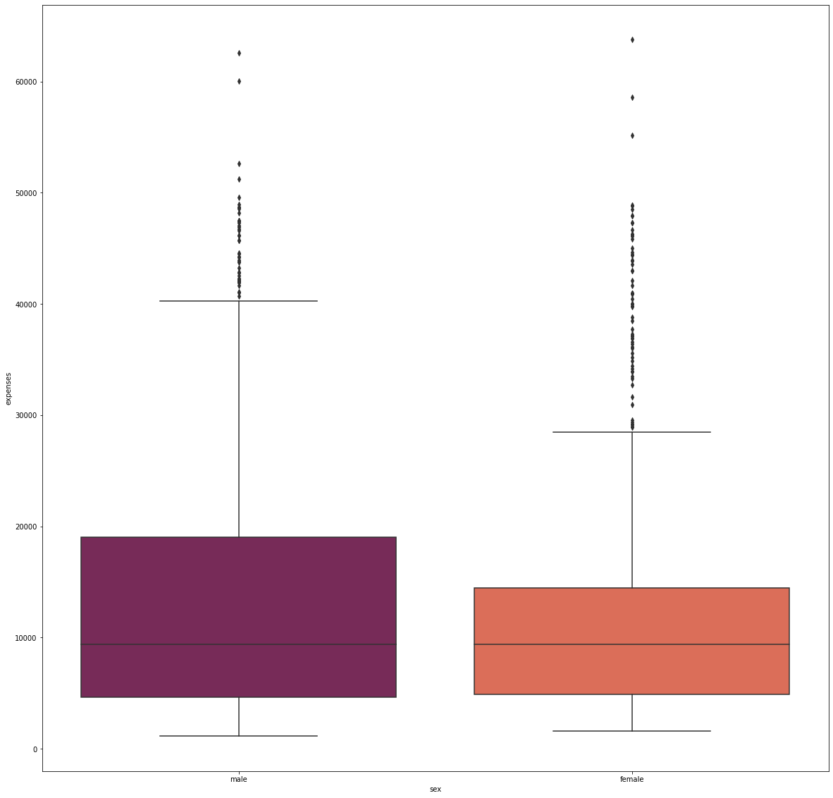
The dataset contained an almost equal number of males and females, and showed no significant difference in terms of their median expenditure. However, the females have a tighter expense distribution than males.
Feature: Region
fig_10, axs_10 = plt.subplots(nrows=1, ncols=1, figsize=(20, 10))
sns.countplot(X_cat['region'], palette='rocket')
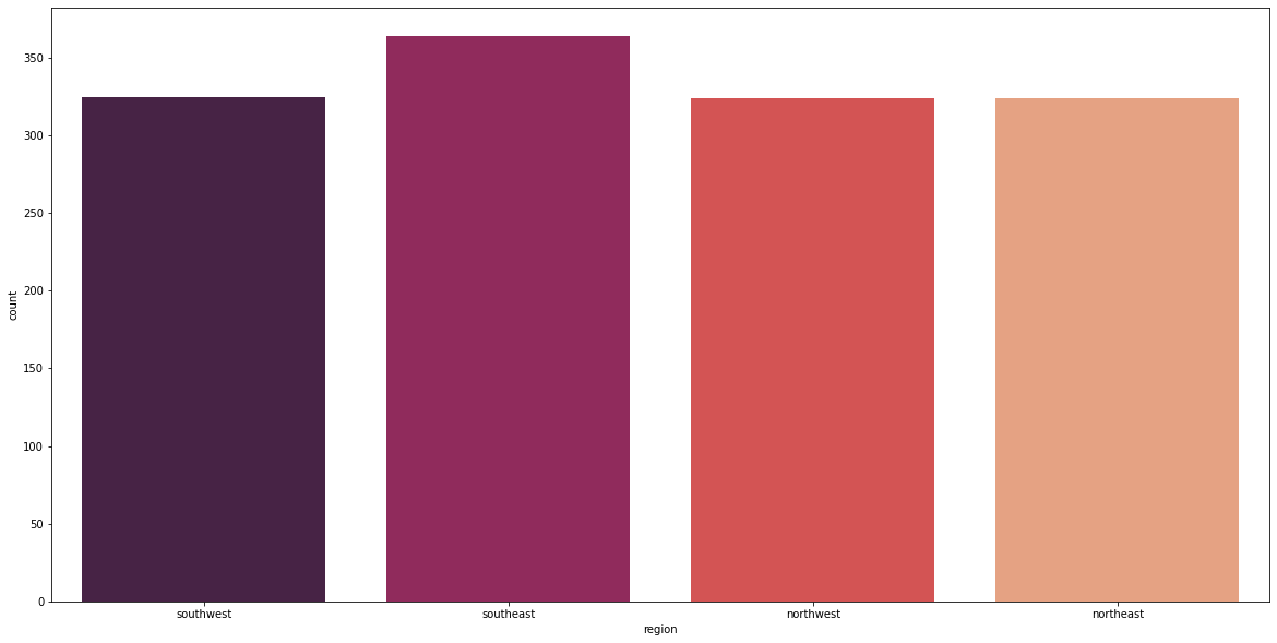
fig_11, axs_11 = plt.subplots(nrows=1, ncols=1, figsize=(20, 20))
sns.boxplot(x='region', y='expenses', data=df, palette='rocket', order=['southwest', 'southeast',
                                                                                     'northwest', 'northeast'])
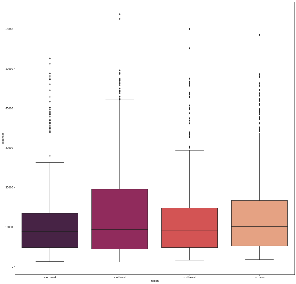
There were no significant difference in the median expenditure with respect to where the individuals are from.
Feature: Smoking Habit
smoker_count = X_cat['smoker'].value_counts().to_frame().rename(columns={'smoker':'frequency'})

fig_12, axs_12 = plt.subplots(nrows=1, ncols=1, figsize=(10, 10))
plt.pie(smoker_count['frequency'], autopct='%.2f%%',
       colors=['#35193e', '#ff9155'], textprops={'color':"w", 'fontsize': 14})
plt.legend(smoker_count.index)

hole=plt.Circle( (0,0), 0.4, color='white')
p=plt.gcf()
p.gca().add_artist(hole)
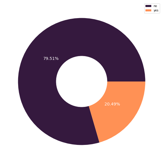
fig_13, axs_13 = plt.subplots(nrows=1, ncols=1, figsize=(20, 20))
sns.boxplot(x='smoker', y='expenses', data=df, palette='rocket', order=['yes', 'no'])
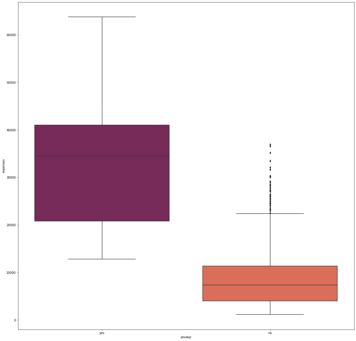
Approximately 80% of the individuals in the dataset are non-smokers, and they incurred significantly lower medical costs. On the other hand, many smokers have higher medical costs that are at least 13,000.
Feature Interactions
Age and BMI
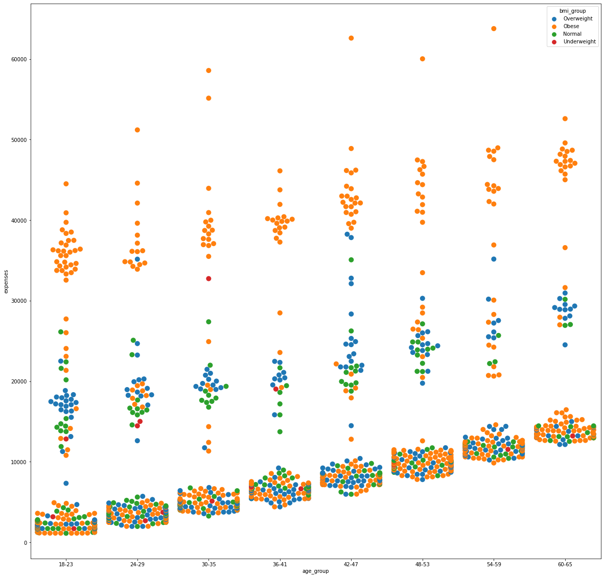
The swarmplot shows that, at each age group, obese individuals are at the upper spectrum in terms of medical costs. There is a clear delineation starting at the 30,000 expense mark showing people above this are mainly obese individuals. As previously discussed, this particular BMI group frequently experiences outlying medical costs.
fig_14, axs_14 = plt.subplots(nrows=1, ncols=1, figsize=(20, 20))
sns.swarmplot(x='age_group', y='expenses', data=df, hue='bmi_group', size=10, order=['18-23', '24-29', '30-35', '36-41',
                                                                                      '42-47', '48-53', '54-59', '60-65'])
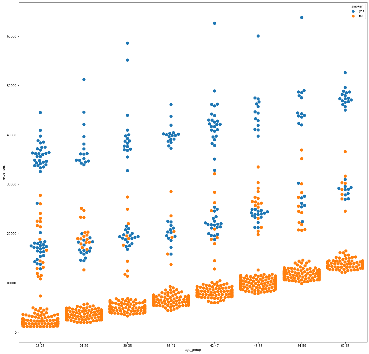
Age and Smoking Habit
By the same token, medical expenses above 30,000 were mainly associated to smokers while non-smokers purely reside at the lower end of the spectrum below 15,000. Data points between these values are observed to be a mix of smoking and non-smoking individuals to which the costs can be attributed to other features.
fig_15, axs_15 = plt.subplots(nrows=1, ncols=1, figsize=(20, 20))
sns.swarmplot(x='age_group', y='expenses', data=df, hue='smoker', size=10, order=['18-23', '24-29', '30-35', '36-41',
                                                                                      '42-47', '48-53', '54-59', '60-65'])
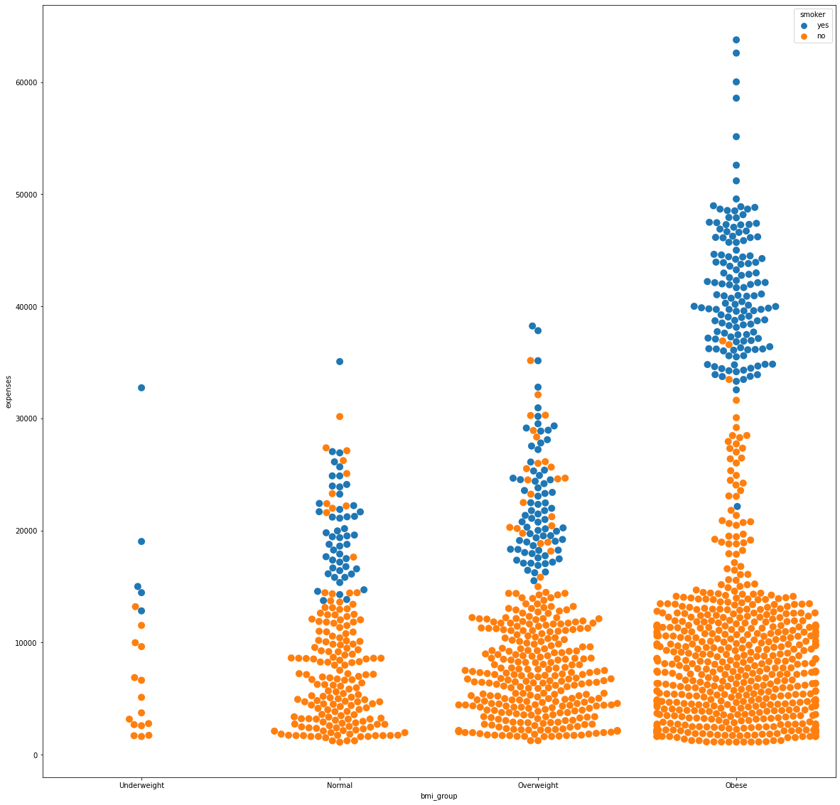
Body Mass Index and Smoking Habit
Pairing the BMI and smoking habit in an analysis showed that smokers remained at the upper spectrum in medical expenses. Furthermore, by looking specifically at the obese group, the smokers have expenses more than 30,000.
fig_16, axs_16 = plt.subplots(nrows=1, ncols=1, figsize=(20, 20))
sns.swarmplot(x='bmi_group', y='expenses', data=df, hue='smoker', size=10, order=['Underweight', 'Normal',
                                                                                       'Overweight', 'Obese'])
Feature Encoding and Scaling
Feature scaling refers to the process of normalizing the scale of the input features to ensure that they are on a similar scale. This is important because many machine learning algorithms use some form of distance or magnitude as a basis for making predictions, and features on a different scale can dominate or be dominated by others.
Feature encoding refers to the process of transforming categorical features into numerical representations.
df = df.drop(['age_group', 'bmi_group'], axis=1)

X_int = df.select_dtypes('int64')
X_flt = df.select_dtypes('float64').drop(['expenses'], axis=1)
X_cat = df.select_dtypes('object')
Y = df['expenses']
One Hot Encoder
One Hot Encoder is a basic type of encoding technique that converts categorical variables into numerical values that can be used in mathematical models. The idea is to create a binary vector for each category, with a 1 for the category that the sample belongs to, and 0s for all the other categories.
from sklearn.preprocessing import OneHotEncoder
from sklearn.preprocessing import OrdinalEncoder

ohe = OneHotEncoder(handle_unknown='ignore')
X_sex_reg = ohe.fit_transform(X_cat[['sex', 'region', 'smoker']])
X_ohe = pd.DataFrame(X_sex_reg.toarray())
labels = ohe.get_feature_names_out(['sex', 'region', 'smoker'])
X_ohe.columns = labels
Robust Scaler
Robust Scaler is a normalization technique that transforms data to have a mean of zero and a variance of one. This helps to reduce the impact of outliers and make the data more suitable for machine learning algorithms that are sensitive to the scale of the input features.
from sklearn.preprocessing import RobustScaler
scaler = RobustScaler()
X_flt_scaled = pd.DataFrame(scaler.fit_transform(df[X_flt.columns]), columns=X_flt.columns)
X_int_scaled = pd.DataFrame(scaler.fit_transform(df[X_int.columns]), columns=X_int.columns)
Y_reshaped = Y.values.reshape(-1,1)
Y_scaled = pd.DataFrame(scaler.fit_transform(Y_reshaped), columns = ['expenses'])
df_scaled = pd.concat([X_flt_scaled, X_int_scaled, X_ohe, Y_scaled], axis=1)
Feature Encoding and Scaling are essential preprocessing steps in machine learning that can have a significant impact on the performance of models. When data is not scaled, features with larger magnitudes can dominate and overshadow smaller features. If categorical data is not encoded, the model will not work due to the nonuniform variable types.
Overall, engineering your data is an important prerequisite to achieve more accurate and efficient machine learning models.
Correlation
Pearson Correlation Coefficient
num_corr = pd.concat([X_flt, X_int, Y], axis=1).corr()

fig_17, axs_17 = plt.subplots(figsize=(15,10))
sns.heatmap(num_corr, annot=True, fmt='.2f')
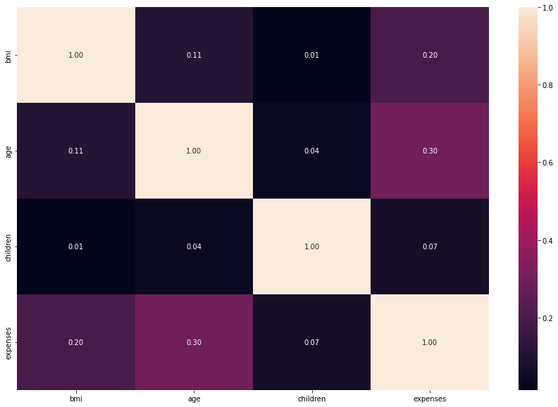
Heatmap showed no significant correlation among features. I would say that the relationships of age and bmi toward the expenses is worth mentioning since they are at 0.30 and 0.20, respectively.
Contingency Table
from scipy.stats import chi2_contingency

pvals={}
alpha = 0.05

for i in X_cat.columns.to_list():
    pvals['%s' %(i)] = []
    for j in X_cat.columns.to_list():
        t = pd.crosstab(X_cat['%s' %(i)], X_cat['%s' %(j)], margins=False)
        stat, p, dof, expected = chi2_contingency(t)
        pvals['%s' %(i)].append(p)

contingency_table_results = pd.DataFrame(pvals, index=X_cat.columns.to_list())

fig_18, axs_18 = plt.subplots(nrows=1, ncols=1, figsize=(15,15))
sns.heatmap(contingency_table_results, annot=True, fmt='.2f')
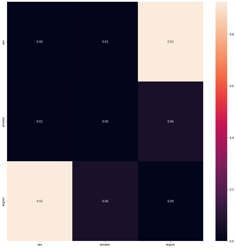
Among the categorical attributes, the chi-squared contingency table showed that the pair region and sex only showed no siginificant relationship with one another
Regression
Regression in machine learning is a supervised learning task used for predicting continuous values. Given a set of input features, the goal of regression is to model the relationship between these features and the target such that the model can make accurate predictions on unseen data.
For this analysis, I implemented three types of approaches: Linear Regression (Base), Random Forests, and XGBoost.
from sklearn.model_selection import train_test_split
X_scaled = df_scaled.drop(['expenses'], axis=1)
Y_scaled = df_scaled['expenses']
X_train, X_test, y_train, y_test = train_test_split(X_scaled, Y_scaled, test_size=0.33, random_state=42)
Linear Regression (Base)
from sklearn.linear_model import LinearRegression
from sklearn.metrics import mean_squared_error, r2_score
lin_reg = LinearRegression()
lin_reg.fit(X_train, y_train)
y_pred = lin_reg.predict(X_test)
lin_mse = mean_squared_error(y_test, y_pred)
print('RMSE:', np.sqrt(lin_mse))
print('R2:', r2_score(y_test, y_pred))
RMSE: 0.521919018853613
R2: 0.7727913719512141
Without conducting any changes yet, the model scored 77.28% which is a fairly good start. The model can still be studied for further improvements by selecting only a number of features that are deemed significant by the Recursive Feature Elimination algorithm.
Recursive Feature Elimination
from sklearn.feature_selection import RFE
from sklearn.pipeline import Pipeline

from numpy import mean
from numpy import std
from sklearn.model_selection import cross_val_score
from sklearn.model_selection import RepeatedKFold
def modelling():
    models = dict()
    for i in range(2, len(X_train.columns)):
        rfe = RFE(estimator=LinearRegression(), n_features_to_select=i)
        model = LinearRegression()
        models[str(i)] = Pipeline(steps=[('s',rfe),('m',model)])
    return models

def evaluate_model(model, X, y):
    cv = RepeatedKFold(n_splits=10, n_repeats=3, random_state=42)
    scores = cross_val_score(model, X, y, scoring='neg_mean_squared_error', cv=cv, n_jobs=-1)
    return scores

models = modelling()
results, names = list(), list()

for name, model in models.items():
    scores = evaluate_model(model, X_train, y_train)
    results.append(scores)
    names.append(name)
    print('>%s %.3f (%.3f)' % (name, mean(scores), std(scores)))
>2 -0.486 (0.222)
>3 -0.425 (0.256)
>4 -0.434 (0.279)
>5 -0.388 (0.239)
>6 -0.389 (0.235)
>7 -0.301 (0.074)
>8 -0.299 (0.075)
>9 -0.270 (0.050)
>10 -0.260 (0.050)
It is advised to use 10 features as it incurred the lowest mean squared error.
top =[]
rfe = RFE(estimator=LinearRegression(), n_features_to_select=10)
rfe.fit(X_train, y_train)
for i in range(X_train.shape[1]):
    print(X_train.columns[i], 'Selected %s, Rank: %.3f' % (rfe.support_[i], rfe.ranking_[i]))
    if rfe.support_[i] == True:
        top.append(X_train.columns[i])
bmi Selected True, Rank: 1.000
age Selected True, Rank: 1.000
children Selected False, Rank: 2.000
sex_female Selected True, Rank: 1.000
sex_male Selected True, Rank: 1.000
region_northeast Selected True, Rank: 1.000
region_northwest Selected True, Rank: 1.000
region_southeast Selected True, Rank: 1.000
region_southwest Selected True, Rank: 1.000
smoker_no Selected True, Rank: 1.000
smoker_yes Selected True, Rank: 1.000
X_train_rfe = X_train[top]
X_test_rfe = X_test[top]

m = LinearRegression()

m.fit(X_train_rfe, y_train)
y_pred = m.predict(X_test_rfe)
m_mse = mean_squared_error(y_test, y_pred)
print('RMSE:', np.sqrt(m_mse))
print('R2:', r2_score(y_test, y_pred))
RMSE: 0.5241553170629731
R2: 0.7708401312929616
Unfortunately, the new results were of slightly lower value than before (a 0.25% decrease in R2) which contradicts my intention for improvements. Therefore, other regression models were explored to see any changes.
Random Forest Regressor
from sklearn.ensemble import RandomForestRegressor
rf = RandomForestRegressor()

rf.fit(X_train, y_train)
y_pred = rf.predict(X_test)
rf_mse = mean_squared_error(y_test, y_pred)
print('RMSE:', np.sqrt(rf_mse))
print('R2:', r2_score(y_test, y_pred))
RMSE: 0.39973820631155405
R2: 0.8667184937399102
Through the most basic level of the random forest regressor, we have achieved a significant improvement in R2 and RMSE at 86.70% and 0.3994, respectively. However, this must be approached with caution since the model might be overfitting/underfitting the prediction and, in turn, makes it unreliable. Optimal parameters for this regressor were sought to fit the data better.
Grid Search
from sklearn.model_selection import GridSearchCV

parameters ={'n_estimators':[int(x) for x in np.linspace(start=100, stop=500, num=10)],
             'max_depth':[4, 6],
             'min_samples_split':[4, 6],
             'min_samples_leaf':[2, 3],
            'random_state':[42]}
rf_imp= RandomForestRegressor()
rf_Grid = GridSearchCV(estimator=rf_imp, param_grid=parameters, cv=5, verbose=3)

rf_Grid.fit(X_train, y_train)
rf_Grid.best_params_
{‘max_depth’: 4, ‘min_samples_leaf’: 3, ‘min_samples_split’: 4, ‘n_estimators’: 500, ‘random_state’: 42}
Improved Random Forest
rf_imp = RandomForestRegressor(**rf_Grid.best_params_)
rf_imp.fit(X_train, y_train)
y_pred = rf_imp.predict(X_test)
rf_mse = mean_squared_error(y_test, y_pred)
print('RMSE:', np.sqrt(rf_mse))
print('R2:', r2_score(y_test, y_pred))
RMSE: 0.3897629994588549
R2: 0.8732874032808368
With new parameters, the metrics improved to 87.33% in R2 and 0.3898 in RMSE
XGBoost Regressor
from xgboost import XGBRegressor
xgb_reg =  XGBRegressor(objective="reg:squarederror", eval_metric='rmse', random_state=42)
xgb_reg.fit(X_train, y_train)
y_pred = xgb_reg.predict(X_test)
xgb_mse = mean_squared_error(y_test, y_pred)
print('RMSE:', np.sqrt(xgb_reg))
print('R2:', r2_score(y_test, y_pred))
RMSE: 0.4384696683738196
R2: 0.8396393952807713
Similar to the previous model, we have achieved a larger R2 and lesser RMSE compared to the base model. To avoid bias, optimal parameters were once again identified to fit the data better.
Grid Search
parameters ={'booster': ['gbtree'],
             'objective':['reg:squarederror'],
             'eval_metric':['rmse'],
             'learning_rate':[0.05, 0.1, 0.15, 0.2],
             'min_child_weight':[2, 4, 6, 8, 10],
             'max_depth':[4, 6, 8, 10],
             'colsample_bytree': [0.5, 0.75, 1],
            'random_state':[42]}
xgb_imp= XGBRegressor()
xgb_Grid = GridSearchCV(estimator=xgb_imp, param_grid=parameters, cv=5, verbose=3)

xgb_Grid.fit(X_train, y_train)
xgb_Grid.best_params_
{‘booster’: ‘gbtree’, ‘colsample_bytree’: 1, ‘eval_metric’: ‘rmse’, ‘learning_rate’: 0.05, ‘max_depth’: 4, ‘min_child_weight’: 10, ‘objective’: ‘reg:squarederror’, ‘random_state’: 42}
Improved XGBoost
xgb_imp = XGBRegressor(**best_params)
xgb_imp.fit(X_train, y_train)
y_pred = xgb_imp.predict(X_test)
xgb_mse = mean_squared_error(y_test, y_pred)
print('RMSE:', np.sqrt(xgb_mse))
print('R2:', r2_score(y_test, y_pred))
RMSE: 0.3877139005096066
R2: 0.8746162319776536
The XGBoost Regressor incurred the highest R2 score and lowest RMSE at 87.46% and 0.3877, respectively.
Top Features
important_features = []
important_features_score = []
for i in range(len(xgb_imp.feature_importances_)):
    if xgb_imp.feature_importances_[i] > 0.001:
        important_features.append(X_train.columns[i])
        important_features_score.append(round(xgb_imp.feature_importances_[i], 3))

df_feature_ranking = pd.DataFrame({'feature': important_features, 'score': important_features_score}).sort_values('score', ascending=False)
            feature  score
8         smoker_no  0.896
0               bmi  0.045
1               age  0.033
2          children  0.007
5  region_northwest  0.006
4  region_northeast  0.004
7  region_southwest  0.004
3        sex_female  0.003
6  region_southeast  0.002
To conclude, the three most important features according to the XGBoost model are the smoking habit, bmi, and age

